 Designed for Tiger's birthday-- her favourite movie director takes on one of his toughest subjects to date. A full star cast join forces with Spielberg in what Entertainment Tonight are saying could be the hit film of the fall season. Or not. More film posters to follow.
 These two characters were also from the Pete Johnson book mentioned in my last post. Which one are you listening to at the moment..?...?
 Blackout is the new title from Robert Swindells, due out later this year. Have just finished this art and am happy with it (so far!). The book is set in Wales at the beginning of WWII, and follows the adventures of four kids growing up during the firsts days of the war. They also get stuck in an abandoned gold mine! Oh, what jolly rotten luck!

 This little fella was designed for a friend of mine, Suzanne Stevenson, who has just launched her new business, I Can You Know!, which provides children with extra tuition in regular, bite-sized lessons tailored to the individual child. This easily accessible on-line teaching method helps to boost confidence and concentration and is especially effective for kids who find it difficult to focus on activities. The short lessons are key and in Suzanne's own words;
‘I Can You Know!’ is for children who need a learning boost. We all want our children to be happy and to achieve their full potential. By providing each child with a specially designed profile of learning activities we can build their confidence and skills. ‘I Can You Know!’ is a statement of self-belief. Our regular reviews and positive mentoring enable children to see themselves as successful learners once more.'
It's a fab idea and I wish Suz great success. For more info and to contact Suzanne, go to; www.icanyouknow.co.uk
 Eating Things On Sticks. A summer read from Anne Fine, this book went through a lot of different designs before we settled on the ice lolly direction. Admit it... you want an ice lolly now, don't you.
 The Spell Book of Listen Taylor. This cover design had to have that whole Bewitched/Bell, Book and Candle feel to it.

 Here's a couple of jobs I worked on for my good friend Chris Waind, over there in New Zealand. One was for the Ministry of Health (Brush those teeth, kids!) and the other was promoting NZ on a kid's TV show. Always good fun working with Mr Waind.
 My daughter has recently discovered the Beast Quest series, which she loves. I'd forgotten that I'd done this test sketch for the inside illos of the third series.


 A few more Bear covers. Scorpion and Tiger were 3-D lenticulars and turned out really well, thanks to the amazing Chinese printers. A little tip for survival if you ever find yourself stranded on an island with Bear Grylls-- NEVER get on a raft with him. He's totally rubbish at building rafts, which usually sink whilst he's far enough away from land to make sure he'd drown or be eaten if the film crew weren't there. Remember, Bear... don't leave the safety, food and water of the island. This way you'll stay away from the sharks, jellyfish, blistering sunburn/sunstroke, starvation, dehydration, typhoons and almost certain watery death, lost at sea.
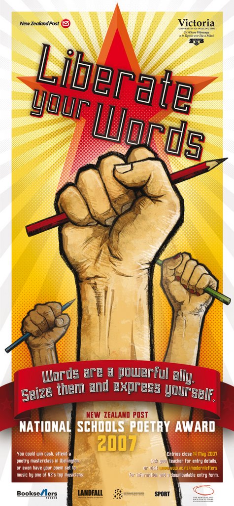
NATIONAL SCHOOL POETRY AWARDS 2007 - NEW ZEALAND POST. Pencil artwork. Colour and design by Chris Waind. This is my most recent colaboration with my good friend, Chris, who is an Art Director at Communication Arts in NZ. We will hopefully be working together this year on a series of children's books. Watch this space.
There was no problem with reference - hands and pencils! - and this poster is an excellent example of working long distance. Chris is 12 hours in my future (and half a planet away), so he briefed me on Sunday night, I finished the linework on Monday, delivering the artwork by FTP. Final art approved and to press on Wednesday (NZ time). Of course because of the time difference it means that Chris has already seen the artwork that I haven't started yet!-- and when they tell me they 'want the artwork by yesterday', that's exactly when I'm doing it. Amazing. Now, if I can just get Chris to phone me with the lottery numbers...
HELLBENT.
Artwork and co-design.
Scroat the Dog makes it on to the cover of Antony McGowan’s comic novel for Doubleday.
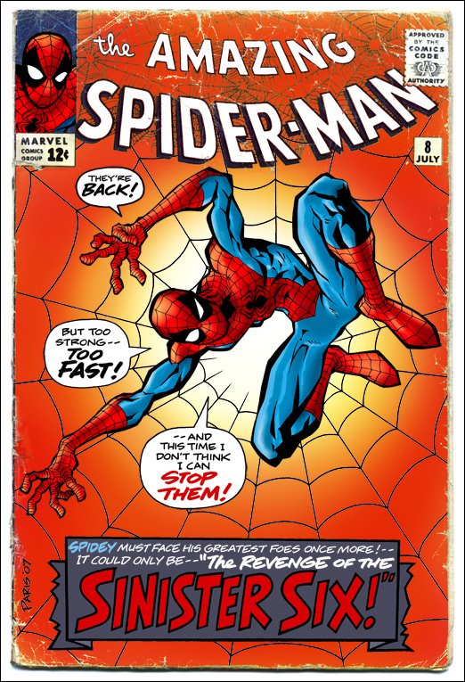
THE AMAZING SPIDER-MAN. Sample comic book cover – artwork and hand lettering.
Drawing SPIDER-MAN isn’t work for me – it’s a pleasure. I first started reading Marvel Comics in 1968, aged 6. I was totally hooked from the moment I was handed a second hand copy of The Amazing Spider-man No.12 (“Unmasked by Dr. Octopus”).
I think I must have spent the next decade constantly drawing Superheroes, so when I left school, aged 16, I pitched up on the doorstep of MARVEL COMICS UK, drawings in hand, looking for a job.
The editor at the time, Paul Neary, took pity on me, so my career in illustration was underway. To be honest, the other job option at the time was being in charge of ‘light brown paint’ on the animation of Watership Down. Not a difficult choice for a teenager.
28 years later and I still get a kick out of drawing our friendly neighbourhood web-slinger.
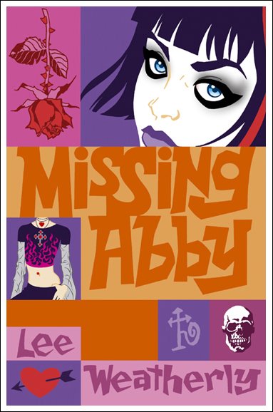
MISSING ABBEY. Artwork and hand lettering.
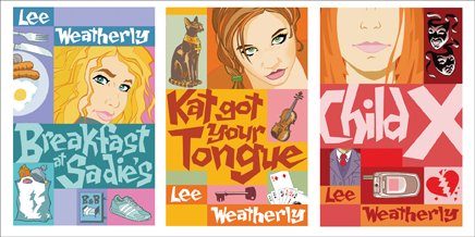
The first of a teen fiction series for Corgi, including Child X, Breakfast at Sadie’s and Kat Got Your Tongue. Co-designed with Tracey Paris.
David Fickling Books/Corgi.
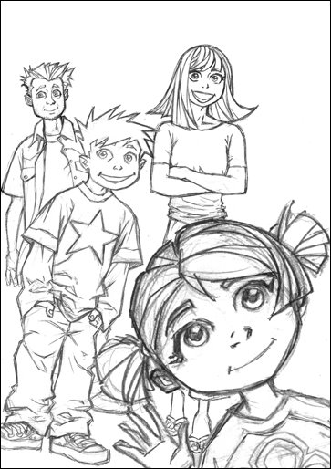
APPLESEED. Character study of Briareos, Hitomi and Deunan. Some of the first Manga to really make an impact over here, along with Akira.
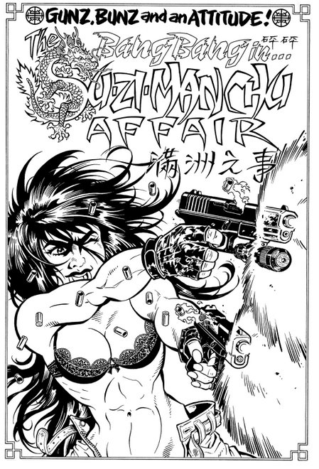
BANG BANG. Artwork and script.
Bang Bang was one of the characters I worked on for Penthouse Comix in the mid 90’s. I had completed the script for The Su-Zi-Manchu Affair and had started in on the artwork when news came of the magazine’s demise. Still, the pages remain and are some of my favourites.
COUNT KARLSTEIN. Art and Design.
A fresh look for Phillip Pullman’s back catalogue.
Transworld.
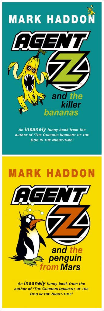
AGENT Z. Art and Design.
Before he became famous for The Curious Incident of the Dog in the Night-Time, Mark Haddon wrote these very funny books.
THE QUIGLEYS.
Proposed character designs for the re-jacketing of a series of books for Random.
CHRIS WAIND. Script and Art. Chris worked at Definition Design and is now living in New Zealand with his wife, Jen. He really is one of life's 'individuals'... and an incredibly talented man too, which is lucky. Had he not turned out to be such a good designer he would have almost certainly gone straight to prison. The strip showed just how unglamorous a designer's life is and Chris was a perfect example, being that he was without any sort of glamour. His days consisted mainly of work and wandering about at lunchtimes, eating sandwiches from Boots the Chemist, whilst letting his mind drift free, usually to think about which sandwich he was going to get from Boots the Chemist. I purchased the rights to his life in exchange for a Whopper meal at London Bridge Station, which doesn't sound quite fair, until I point out that he did order the large fries.
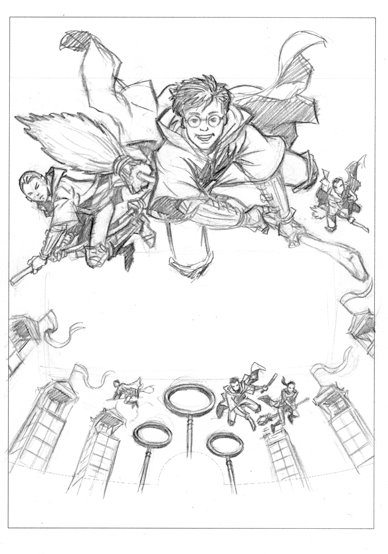
HARRY POTTER. Pencil sketches for the marketing of the game Harry Potter and the Chamber of Secrets. The work was done for Feref, who's art director, Neill Furmston, is, I've heard it said, quite possibly the best art director in the world.
HARRY POTTER. Sketches/packaging designs for Quidditch World Cup, again for Feref. Neill was best man at my wedding... Well done, mate!
SHOCK CITY. Script and Art.
This was a comic strip produced for T.W.O. magazine, a motorcycle mag. Girls and Bikes, pretty much what you’d expect. John Cantlie was a great editor to work with and I’ve never met a bloke more born to be on TV than John. Which is what he’s doing now!
HOW ANGEL PETERSON GOT HIS NAME. Art and co-design.
Gary Paulsen is one of my favourite writers, so it was a treat to work on this book. I can’t recommend Gary Paulsen highly enough, especially; Zero to Sixty: the Motorcycle Journey of a Lifetime, Brian’s Winter and Angel Peterson.
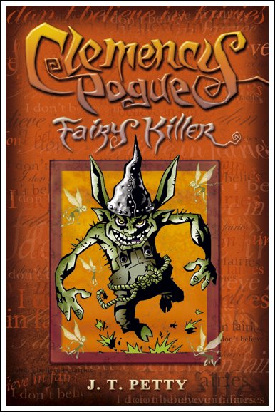
CLEMENCY POGUE, FAIRY KILLER.
Character designs and proposed book jacket for Simon & Schuster. The hobgoblin above goes by the name of CHAPHESMEESO.
PHANTOM FEAR. Art and design. A clean, graphic approach to the re-jacketing of Pete Johnson's books.
TALISMAN. Design, Art and Lettering. A series of adventure books, with a kind of 'Indiana Jones' theme. Each book is set in a different location; Eygpt, South America, India and China. Hodder.
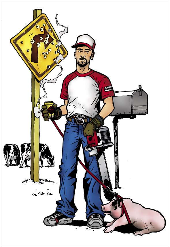
WHITE TRASH CHRIS. Mr Waind during his 'good 'ol boy' phase. Squeal like a piggy!
BATMAN... and Robin the Boy Wonder. I loved the Bruce Timm animations. Batman didn't make much of an impression on me until Neal Adams' work in the 70's and then again in the 8o's with Frank Miller's Dark Knight. In general I think there are more of us that can relate to Spider-Man's alter-ego, Peter Parker (struggling student who has to take part-time jobs to pay his way) than Bruce Wayne - a billionaire industrialist playboy. Still, at least he had enough money to do a really good job on the batcave -- and he can afford to have Alfred the butler on hand, in case he needs an espresso (a man Bruce's age has gotta be using a lot of caffeine to stay up night after night with the crime-fighting).
THE HOUSE OF DOCTOR DEE. An illustration for the BBC R4 afternoon play of the same name. Radio Times Magazine.
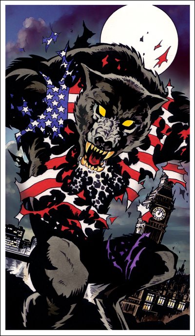
AN AMERICAN WEREWOLF IN LONDON. Another illo for the radio pages of Radio Times Magazine.


