... and Happy Hallowe'en! Here's a bit of artwork I found whilst looking through some old and dusty parts of my hard drive. It was drawn for a puzzle mag (hence the dead areas in the picture) but I thought it might make a good Hallowe'en party invite - space left to fill in your own details etc.
Haven't been doing much artwork lately but am now working on several new book jackets and a couple of comic strip ideas, so more soon.
 WOLVERINE - UPDATED. Thought I'd add some texture and darkness to the sketch-- something I'd been meaning to get around to for awhile. I think it looks much grittier now and more in keeping with Logan's character. The figure is actually referenced from a photo of me!-- kneeling on my office chair, wearing my 'Bruce Willis' regulation vest, whilst snarling at my wife, Tracey, who was taking the pictures. When they have the 'What do your parents do at work' day at my daughter's school, she'll be saying; "Daddy balances on his chair in his vest, pulling faces at Mummy, who's taking pictures with her camera."
 Born Survivor Bear Grylls turns his hand to teenage fiction, with the first of a boy's own series of adventures. This cover has been through a few changes. Originally Tracey and I were asked to design a series look that reflects the boy's adventure/survival market, keeping the author name prominent and using a few special finishes if we liked. Also, we needed to design a branding for the series. The design went through fairly smoothly, with only a few minor changes. However, just before going to print, it was decided that the direction was to be altered and now a 'lenticular' cover was required. For those that don't know, 'lenticular' printing is the kind of picture that's either in 3-D or animated, the images changing as you change your viewing angle. Also, a different series branding was needed-- slicker and with more effects.
Now, I'm an illustrator--
not an animator, which requires a completely new skill set!-- so I had to get my head around making the animations work, along with putting the figure in a circular compass device, which was something else that had found its way into the now jam-packed requirements! The animation cells, seen above, were sent to China, where the lenticular part of the print was/is being done. Once the process is complete, the lenticular discs are then sent back to the UK, where they're stuck on the printed cover.
The big question is; will it work?... I'm keeping my fingers crossed but I've seen some pretty awful cock-ups recently with these kind of effects. I've been trying to cheer myself with a fantastic example of lenticular print, which was a Cadbury 'Magic of Christmas' chocolate selection box that I picked up for reference last month. Will production have specified the printing of Bear's cover this well without chocolate being involved? Still, the Chinese are great at print, so all should be well. Here's the first version of the cover;

My 6 year old daughter, Tiger, has become quite the survival expert, mainly due to her massive crush on Mr. Grylls!-- we now have 'Grylls Night', where Tiger gets to stay up late on Friday, to watch Man vs. Wild on the Discovery Channel. We snack to keep our strength up (snails, scorpions etc) and Tiger self-edits the episodes (thumbs in ears, fingers over eyes) as she's not too keen on the more gory elements of survival. It will obviously fall to me to be red of tooth and claw, should we need to survive away from Tesco, Sainsbury and Waitrose. And if you're reading this, Mr.Grylls, Tiger would love a signed photo! Ta.
 3 Different versions of a cover that was fully Tracey's design. My job on this one was pretty much to draw up the figure and photograph the apple, following closely the roughs that I was shown.
Can't remember which version they've used and I can't ask Tracey, as she's just gone out--- it's either the red, white or black one.
P.S. Tracey says they've used a black version-- front cover is now just the hand and the face is on the back of the book.
 This is cover art I did for the latest Liz Rettig book, commissioned by Tracey, who was doing the design. I think the hearts are being printed on a trace overlay, to fit stylistically with the previous books we've designed for this author. Bit of a rush, just before Christmas-- but I quite like how it's turned out.
 NOW WITH ADDED BLOOD!... these are the final designs for the collections. Good fun to do, as I could spend an hour or so splattering ink all over large sheets of white card. By the end of the afternoon the studio looked like a scene from Sweeney Todd.
 The Pumpkin Lantern has been replaced with cadaverous hands clawing their way out of the grave. They just didn't like the pumpkin!-- I was going to suggest a butternut squash but Tracey thought it best to lay off the vegetables and just get on with illustrating the hands. Always the voice of reason.
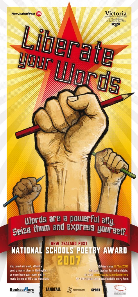
NATIONAL SCHOOL POETRY AWARDS 2007 - NEW ZEALAND POST. Pencil artwork. Colour and design by Chris Waind. This is my most recent colaboration with my good friend, Chris, who is an Art Director at Communication Arts in NZ. We will hopefully be working together this year on a series of children's books. Watch this space.
There was no problem with reference - hands and pencils! - and this poster is an excellent example of working long distance. Chris is 12 hours in my future (and half a planet away), so he briefed me on Sunday night, I finished the linework on Monday, delivering the artwork by FTP. Final art approved and to press on Wednesday (NZ time). Of course because of the time difference it means that Chris has already seen the artwork that I haven't started yet!-- and when they tell me they 'want the artwork by yesterday', that's exactly when I'm doing it. Amazing. Now, if I can just get Chris to phone me with the lottery numbers...
HELLBENT.
Artwork and co-design.
Scroat the Dog makes it on to the cover of Antony McGowan’s comic novel for Doubleday.
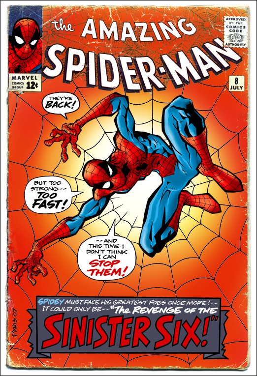
THE AMAZING SPIDER-MAN. Sample comic book cover – artwork and hand lettering.
Drawing SPIDER-MAN isn’t work for me – it’s a pleasure. I first started reading Marvel Comics in 1968, aged 6. I was totally hooked from the moment I was handed a second hand copy of The Amazing Spider-man No.12 (“Unmasked by Dr. Octopus”).
I think I must have spent the next decade constantly drawing Superheroes, so when I left school, aged 16, I pitched up on the doorstep of MARVEL COMICS UK, drawings in hand, looking for a job.
The editor at the time, Paul Neary, took pity on me, so my career in illustration was underway. To be honest, the other job option at the time was being in charge of ‘light brown paint’ on the animation of Watership Down. Not a difficult choice for a teenager.
28 years later and I still get a kick out of drawing our friendly neighbourhood web-slinger.
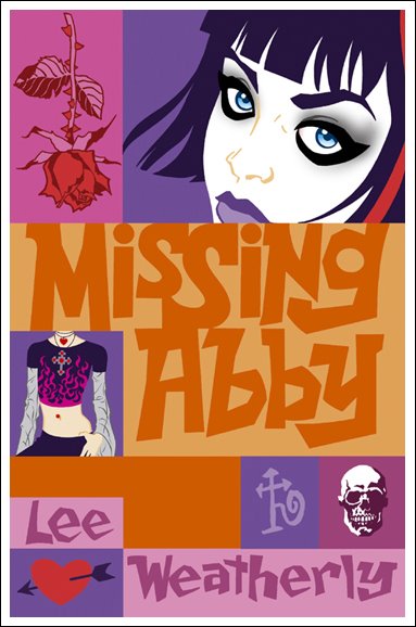
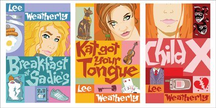
MISSING ABBEY. Artwork and hand lettering.
The first of a teen fiction series for Corgi, including Child X, Breakfast at Sadie’s and Kat Got Your Tongue. Co-designed with Tracey Paris.
David Fickling Books/Corgi.
APPLESEED. Character study of Briareos, Hitomi and Deunan. Some of the first Manga to really make an impact over here, along with Akira.
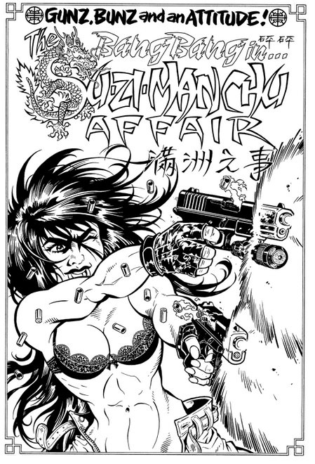
BANG BANG. Artwork and script.
Bang Bang was one of the characters I worked on for Penthouse Comix in the mid 90’s. I had completed the script for The Su-Zi-Manchu Affair and had started in on the artwork when news came of the magazine’s demise. Still, the pages remain and are some of my favourites.
COUNT KARLSTEIN. Art and Design.
A fresh look for Phillip Pullman’s back catalogue.
Transworld.
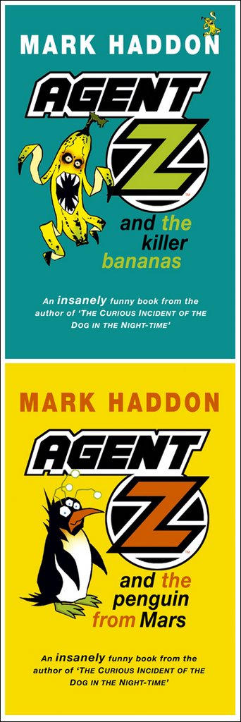
AGENT Z. Art and Design.
Before he became famous for The Curious Incident of the Dog in the Night-Time, Mark Haddon wrote these very funny books.
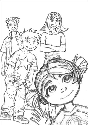
THE QUIGLEYS.
Proposed character designs for the re-jacketing of a series of books for Random.
CHRIS WAIND. Script and Art. Chris worked at Definition Design and is now living in New Zealand with his wife, Jen. He really is one of life's 'individuals'... and an incredibly talented man too, which is lucky. Had he not turned out to be such a good designer he would have almost certainly gone straight to prison. The strip showed just how unglamorous a designer's life is and Chris was a perfect example, being that he was without any sort of glamour. His days consisted mainly of work and wandering about at lunchtimes, eating sandwiches from Boots the Chemist, whilst letting his mind drift free, usually to think about which sandwich he was going to get from Boots the Chemist. I purchased the rights to his life in exchange for a Whopper meal at London Bridge Station, which doesn't sound quite fair, until I point out that he did order the large fries.
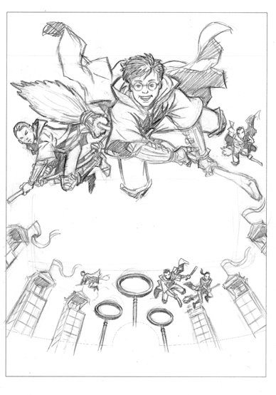
HARRY POTTER. Pencil sketches for the marketing of the game Harry Potter and the Chamber of Secrets. The work was done for Feref, who's art director, Neill Furmston, is, I've heard it said, quite possibly the best art director in the world.
HARRY POTTER. Sketches/packaging designs for Quidditch World Cup, again for Feref. Neill was best man at my wedding... Well done, mate!
SHOCK CITY. Script and Art.
This was a comic strip produced for T.W.O. magazine, a motorcycle mag. Girls and Bikes, pretty much what you’d expect. John Cantlie was a great editor to work with and I’ve never met a bloke more born to be on TV than John. Which is what he’s doing now!
HOW ANGEL PETERSON GOT HIS NAME. Art and co-design.
Gary Paulsen is one of my favourite writers, so it was a treat to work on this book. I can’t recommend Gary Paulsen highly enough, especially; Zero to Sixty: the Motorcycle Journey of a Lifetime, Brian’s Winter and Angel Peterson.
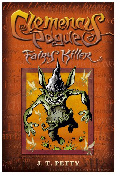
CLEMENCY POGUE, FAIRY KILLER.
Character designs and proposed book jacket for Simon & Schuster. The hobgoblin above goes by the name of CHAPHESMEESO.
PHANTOM FEAR. Art and design. A clean, graphic approach to the re-jacketing of Pete Johnson's books.
TALISMAN. Design, Art and Lettering. A series of adventure books, with a kind of 'Indiana Jones' theme. Each book is set in a different location; Eygpt, South America, India and China. Hodder.
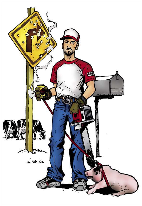
WHITE TRASH CHRIS. Mr Waind during his 'good 'ol boy' phase. Squeal like a piggy!
BATMAN... and Robin the Boy Wonder. I loved the Bruce Timm animations. Batman didn't make much of an impression on me until Neal Adams' work in the 70's and then again in the 8o's with Frank Miller's Dark Knight. In general I think there are more of us that can relate to Spider-Man's alter-ego, Peter Parker (struggling student who has to take part-time jobs to pay his way) than Bruce Wayne - a billionaire industrialist playboy. Still, at least he had enough money to do a really good job on the batcave -- and he can afford to have Alfred the butler on hand, in case he needs an espresso (a man Bruce's age has gotta be using a lot of caffeine to stay up night after night with the crime-fighting).
THE HOUSE OF DOCTOR DEE. An illustration for the BBC R4 afternoon play of the same name. Radio Times Magazine.
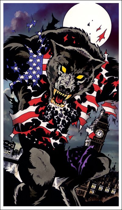
AN AMERICAN WEREWOLF IN LONDON. Another illo for the radio pages of Radio Times Magazine.